Bhoomika Jain.

Key Issues Identified
Setting up of profiles is lengthy process and puts a lot of cognitive load on the users
The profile is live as soon as the user uploads their photos. This pressurises the user to get to swiping quickly
In a hurry to start swiping, the users miss our on relevant information in their profiles
Profiles are majorly photo heavy
Bumble | Design Brief
This project aims to study human behaviour on the dating app Bumble. To question the intent and expectations of the users and the features of the application. And lastly, to uncover the deviant behaviours that exist on the platform and explore the possible solutions to solve the issues that arise as a consequence.
The aim was also to identify the how the behaviours are linked to the UI of the application.
Duration: 4 weeks
Team: Bhoomika Jain | Dikshita Pant
Outputs Delivered
A gamified onboarding experience for the users
New and improved profiles, 90% of the screen real estate is maintained for the profile with increased focus on the person, their interests and intent
Increased trust and transparency on the application
Research Flow

-
Choosing Topic
-
Secondary Research of the app
-
Study of Human Behaviour
-
Study of deviant behaviours on the app
-
UI Audit
-
UX Analysis
-
Preparing Tools for Primary research
-
Conducting Polls and Surveys
-
Conducting Workshops and interviews
-
Data Analysis
-
Insight Generation
-
Problem Statements
-
Design Solutions
-
Prototype
-
Documentation
Week 1
Week 2
Week 3
Week 4
Secondary Research
We commenced the project by looking into the data that was already available to us, to gain an understanding of everything that is BUMBLE. The research focused on understanding the Dating App market, the story of Bumble, its values, features and competitors.
A social network empowers the user while making social connections
Encourages integrity, kindness, equality, confidence, and respect
Shifting old-fashioned power dynamics and encouraging equality
Core Purpose of Bumble

Bumble is a platform and community that creates empowering connections in love, life, and work. We promote accountability, equality, and kindness in an effort to end misogyny and re-write archaic gender roles. On Bumble, women always make the first move.
Mission Statement
Bumble envisions a world free of misogyny, where all relationships are equal.
Vision Statement
The global dating app market is expected to surpass $8.4 billion by 2024. With these kinds of proposed growths there is plenty of competition in the market for bumble
Dating Apps Market Revenue in Mn
Bumble has the second largest market share in the dating app segment

Market Share of Bumble
Bumble offers three modes of social networking:
Bumble Date | Bumble BFFs | Bumble Bizz
For the purpose of this study, the focus is on Bumble Date

Preliminary Research

Research Methods:
Netnography
(Auto)Netnography
UI Audit
Usability Heuristics
Netnography
A male participant was asked to set up their Bumble account from scratch. This was done to understand the onboarding process and identify the differences that may exist between the male and female profiles on the platform.

(Auto)Netnography
The account of an existing female user was looked at, to get a lay of the land. The objective was to locate features that reside within the application and understand the user journey(s) that exist on the platform.

UI Audit
We looked at all the screens of the application to understand what lives where. Each feature was examined and this examination was accompanied by questioning the reasons for it’s placement within the application.

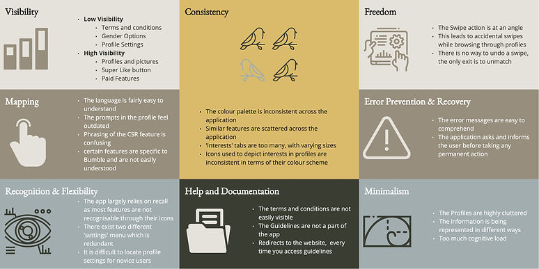
Usability Heuristics
As a culmination of preliminary research, a heuristics analysis was conducted to understand what works for the platform and what does not.
Primary Research

Social Media Poll
To commence primary research, we started off by trying to reach out to a larger audience to understand the user base better. We put up stories on our instagram for people to engage with, and asked them basic questions

Survey
To validate the observations and insights that we generated from the initial instagram poll, we created a dynamic survey and shared it with as many people as possible.The survey was live for about a week and we gathered 96 responses in total.

Focus Groups
The next step in the research was to talk to the various users. For this we designed our sample for maximum representation and reached out to participants who were willing to speak with us regarding their experiences, preferences, likes and dislikes related to Bumble. We spoke to 10 users in total for this.

Expert Interview
Following our interviews with users, we sought out an expert in the field of user interface and experience. We discussed our findings related to the platform and user experience with them and took their inputs regarding the same.
What we found was,


Date is the most used section on the app
Most people refrain from using bumble due to functional reasons
Women admit to having made more genuine connections on the app
Men used the app for a longer stretch of time
Most women have been using the app on and off
Unavailability of genuine profiles and ease of connecting with like minded people are the two things people look for in the app
Larger chunk of users are from the age bracket of 24-29 years
Participatory Workshop
To further our understanding on the subject matter, we designed a workshop consisting of three research tools to be conducted over Zoom and Miro.
The workshop was conducted over 3 days, with a total of 30 people, in smaller groups.
For this we sent out invites to participants through mail with a form to know their availability, preferred day and time. .

The Tools

We found,
‘Set up your profile’ probed the users to tell us the kind of information they were looking to see on the profiles they were swiping to and the information they were willing to share on their own profiles.
This tool was designed to examine the current usage of all features available on the platform. All existing features were listed and the users were required to sort them out based on their personal usage of these features, by colour coding them.
To better define the problem areas in the user experience, we asked participants to rate their experiences on the application. Following the individual mapping activity, we studied the maps together to get an overall picture of the user journey and experience.
Major dissatisfaction is with engaging with the paid services and continuing conversations
A large part of initial journey offers 'Neutral' Experience for the users in their journey. Which can be elevated to 'Happy'
The logging in and out of the application is a good and simple experience for the users
The paid features are not widely used.
A lot of unpaid features such as conversation filters are not used much. This maybe due to the fact that the filters are not very relevant.

Self Profile

Information the users want to see/share
Match's Profile
Deviant Behaviours on Bumble
Cat Fishing
Faux Feminism
Lack of Inclusivity
Fake Profiles
Shame associated with being on Bumble
Lack of Interest amongst the users
Superficial and short term bonds
As means to pass time
Identified Problem Areas
Setting up of profiles is lengthy process and puts a lot of cognitive load on the users
In a hurry to start swiping, the users miss our on relevant information in their profiles
Profiles are majorly photo heavy
The promotion of the paid features mostly leads to dead ends and needs to be relooked at
The profile is live as soon as the user uploads their photos. This pressurises the user to get to swiping quickly
Verification of profiles is an important features for the users yet it is not compulsory
Different settings are scattered across the app
The paid and unpaid features need a clear distinction
How Might We?
How may we promote the paid features more efficiently?
How may we make the profile set up engaging?
How may we simplify the onboarding process?
How may we make navigation easier on the app?
How may we streamline the brand language on the app?
Proposed Solution
We propose a gamified experience of setting up profiles on Bumble. The user answers some questions in a quiz format, adds photos, and previews the auto generated information on their profile, before going live!
his helps us focus more on 'people' rather than photos and enhances user experience.
The Idea

The purpose of this solution is to simplify the onboarding process, and ensure that relevant information is shared by users.
The Aim

Prototype

Through this design, we are delivering:
To view the video prototype, click here
Information in profiles that is relevant
Reduction in cognitive load for the users while setting up the profile
A considerable reduction in profiles without information
Shifting the focus from photos to personality
Contribution towards building trust

Reflections
There are a lot of deviant behaviours that can be observed in the application. A lot of functions on the app which facilitate those deviant behaviours can be eliminated with the help of UI/UX interventions.
Promoting instant gratification combined with the perpetual lack of interest leads to unfulfilled expectations from the application leading to loss of users. There is a lot of scope for changes in the application. But these may have business implications, which can be better explored if more data on the business is made available.
To view full project report, click here